Key Considerations When Selecting a Data Visualisation Tool
Data visualisation is the visual representation of datasets that allows individuals, teams and organisations to better understand and interpret complex information both quickly and more accurately. Besides considering the cost of the tool itself, there are other key considerations when selecting a data visualisation tool to implement within your business. These include:
- Identifying who are the end-users that will be consuming the data visualisation
- What level of interactivity, flexibility and availability of the data visualisation tool is required from these users?
- What type of visualisations are needed to fit the business/problem statement and what type of analytics will drive this?
- Who will be responsible for maintaining and updating the dashboards and reports within the visualisation tool?
- What is the size of the datasets and how complex are the workloads to be ingested into the tool?
- Is there an existing data pipeline setup or does this need to be engineered?
- Are there any requirements to perform pre-processing or transformation on the data before it is ingested into the data visualisation tool?
The primary objective of data visualisation is to help individuals, teams and companies explore, monitor and explain large amounts of data by organizing and allowing for more efficient analysis and decision-making by enabling users to quickly identify patterns, correlations, and outliers in their data.
Data visualisation is an important process for data analysis and other interested parties as it can provide insights and uncover hidden patterns in data that may not be immediately apparent through either tabular or textual representations. With data visualisation, data analysts and other interested parties such as business SMEs can explore large datasets, identify trends from these datasets, and communicate findings with stakeholders more effectively.
There are many types of data visualisations that can be used depending on the type of data being analysed along with the purpose of the analysis. Common types of visualisations include graphs, bar charts, line scatter plots, heat maps, tree maps, and network diagrams.
For data visualisation to be effective, it requires careful consideration of the data being presented, the intended audience, and the purpose of the analysis. The visualisation that is being presented should be clear, concise, and visually appealing, with labels, titles, and colours used to highlight important points and make the information more accessible to the audience. The data visualisation needs to an effective storytelling mechanism for all end-users to understand easily. Another consideration is the choice of colours used, as the wrong colours can impact the consumers of the data visualisation and can impact visually impaired people (i.e., colour blindness, Darker vs Brighter contrasts as examples)
In recent years, data visualisation has become increasingly important as data within organisations continues to grow in complexity. With the advent of big data and machine learning technologies, data visualisation is playing a critical role in helping organisations make sense of their data, and become more data-driven with increased ‘time to insight’, as organisations facilitate better and faster decision-making.
Data Visualisation Tools & Programming Languages
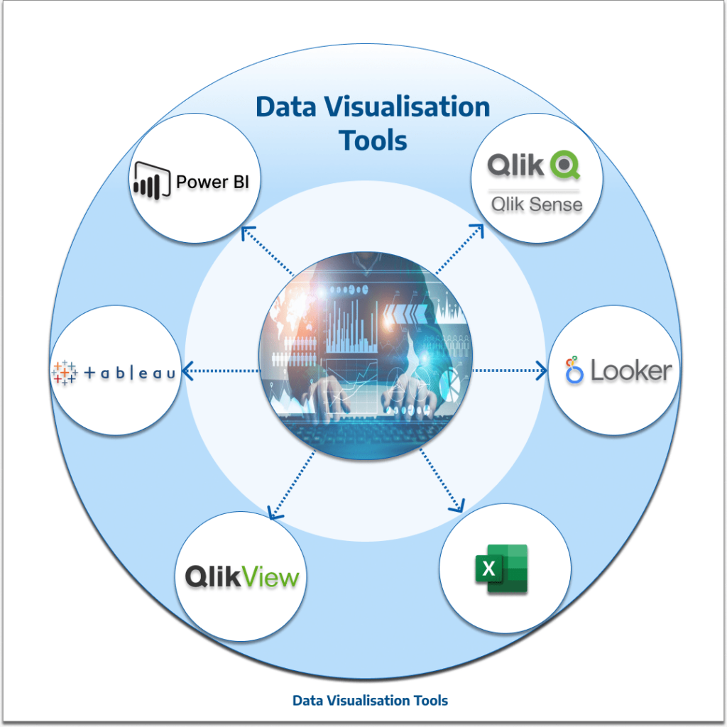
At TL Consulting, our skilled and experienced data consultants use a broad range and variety of data visualisation tools to help create effective visualisations of our customer’s data. The most common are listed below:
- Power BI is a business intelligence tool from Microsoft that allows users to create interactive reports and dashboards using data from a variety of sources. It includes features for data modelling, visualisation, and collaboration.
- Excel: Excel is a Microsoft spreadsheet application and from a data visualisation perspective includes the capability to represent numerical data in a visual format.
- Tableau: Tableau is a powerful data visualisation tool that allows users to create interactive dashboards, charts, and graphs using drag-and-drop functionality. It supports a wide range of data sources and has a user-friendly interface.
- QlikView: QlikView is a first-generation business intelligence tool that allows users to create interactive visualisations and dashboards using data from a variety of sources. QlikView includes features for data modelling, exploration, and collaboration.
- Looker: Looker is a cloud-based Business Intelligence (BI) tool that helps you explore, share, and visualise data that drive better business decisions. Looker is now a part of the Google Cloud Platform. It allows anyone in your business to analyse and find insights into your datasets quickly.
- Qlik Sense: Qlik Sense is the next-generation platform for modern, self-service-oriented analytics. Qlik Sense supports from self-service visualisation and exploration to guided analytics apps and dashboards, conversational analytics, custom and embedded analytics, mobile analytics, reporting, and data alerting.
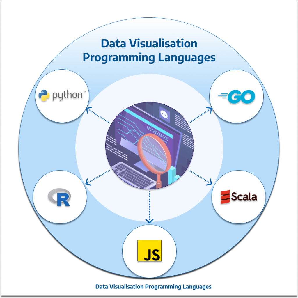
In conjunction with the data visualisation tools listed above, there are a variety of programming languages using their various libraries that TL Consulting use in delivering outcomes to our customers that support not just Data Visualisation but also Data Analytics.
- Python is a popular programming language that can be used for data analysis and visualisation. This can be done via tools such as Jupyter, Apache Zeppelin, Google Colab and Anaconda to name a few. Python includes libraries such as Matplotlib, Seaborn, Bokeh and Plotly for creating visualisations.
- R is a programming language used for statistical analysis and data visualisation. It includes a variety of packages and libraries for creating charts, graphs, and other visualisations.
- Scala is a strong statically typed high-level general-purpose programming language that supports both object-oriented programming and functional programming. Scala has several data visualisation libraries such as breeze-viz, Vegas, Doodle and Plotly Scala.
- Go or Golang is a statically typed, compiled high-level programming language designed at Google. Golang has several data visualisation libraries that facilitate the creation of charts such as pie charts, heatmaps, scatterplots and boxplots.
- JavaScript is a popular programming language that is a core client-side language of the w3. It has rich data visualisation libraries such Chart JS, D3, FusionCharts suite, Pixi etc.
Conclusion
In conclusion, there are several data visualisation tools and techniques available in the market. For organisations to extract meaningful insights from their data in a time-efficient manner, it’s important to consider these factors before selecting and implementing a new data visualisation tool for your business.
TL Consulting provides advisory and transformation services in the data analytics & engineering domain and has helped many organisations achieve their digital transformation goals.
Visit TL Consulting’s data-engineering page to learn more about our service capabilities and send us an enquiry if you’d like to learn more about how our dedicated consultants can help you.